Category Archives: MATS

D is for Digital Nomad

Digital Nomad Illustration

‘How To Succeed At Becoming A Digital Nomad’

That was the title of the article for the above editorial illustration. Created for the June MATS Bootcamp course.

Click here to read the article from Forbes.com

This is one of the first times I have attempted to draw people in my illustrations. But I really enjoyed the process and plan to experiment with some more editorial illustration briefs in the future.


A is for Art

Art Gathering Poster

For MATS April Bootcamp Assignment we were given the job of creating a poster for the upcoming Global Art Gathering event in Brighton.

The mini had been to hand letter the words Global Art Gathering.

poster sketches_jw

Hand lettering sketches


After creating the lettering by hand using pencil, pen & ink.

I then scanned the drawings and took them into illustrator. Using the sketch as an idea for a composition, I created the poster design in illustrator using the colour palette that had been given to us.

vector artwork-01

Vector artwork without texture

Art Gathering Poster

photoshop artwork with texture added


I then added texture to the vector artwork in Photoshop using clipping masks and hand made brushes & textures. I really liked this technique and am looking forward to exploring this technique further.

P is for Pirate

This was a collection of kids illustrations and prints created last year. I struggled a little with the colour palette and deciding whether to work in Illustrator or photoshop. Having worked on it on and off for several months I am finally happy to reveal it here.

P is for Pirate_pattern_sisiforscribble

In the end I went with a simpler turquoise, purple and dark blue palette. I also pushed through with illustrator to create the patterns and artwork, prefering he flat colours for these compositions.

Below are some of the additional co-ordinating patterns in more detail:

Pattern Gallery

Anchors Ahoy

Pirate knots pattern_sisforscribble


Knotted (I’m still loving the rope & knotted nautical designs; here in a pale turquoise)

Pattern Gallery3


Palm Deco (revisiting a my palm tree pattern that works really well with this theme; recoloured in purple to match the colourway)


M is for Misty Mountain

M is for misty mountains_web

blue doodles

February Bootcamp mini was to draw from scenic plates. I chose to look at blue & white chinoiserie plates (which I have been really drawn to for sometime) so I was really excited to crack open the inks again and get drawing. For a bit of a change I decided to experiment with blue ink (rather than drawing with black ink & colouring it later in Photoshop)

The final design was to create a piece of art painted onto a piece of circular wood. Unfortunately I didn’t have enough time to find a piece of wood but used a photo I had instead and composited this with my original mini drawings.

I really liked the translucent quality and used this when layering up the final piece along with some paint textures. To create this quite mystical, magical moody mountain piece.

B is for Brooch

2015 kicked off with another round of creative bootcamp in the form of Lilla Rogers MATS bootcamp course. This first month we were tasked with creating a journal design inspired by Edwardian brooches.

The brooches I was most drawn to were simple designs with beautiful faceted gems in greens and purple.

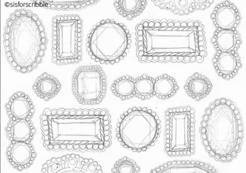
Here are some of my initial doodles and drawings of the gems:
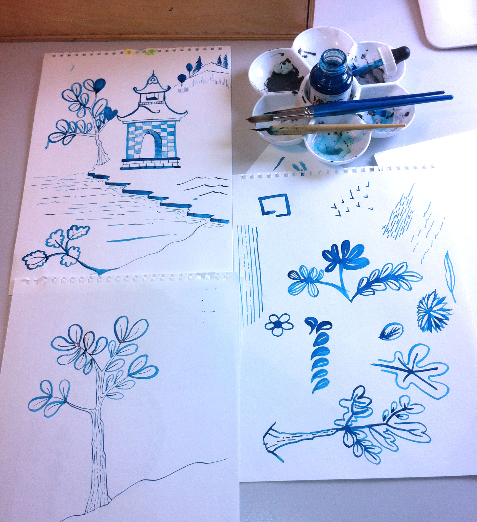
  brooch sketches page web2

ink & wash drawings

pencil sketches

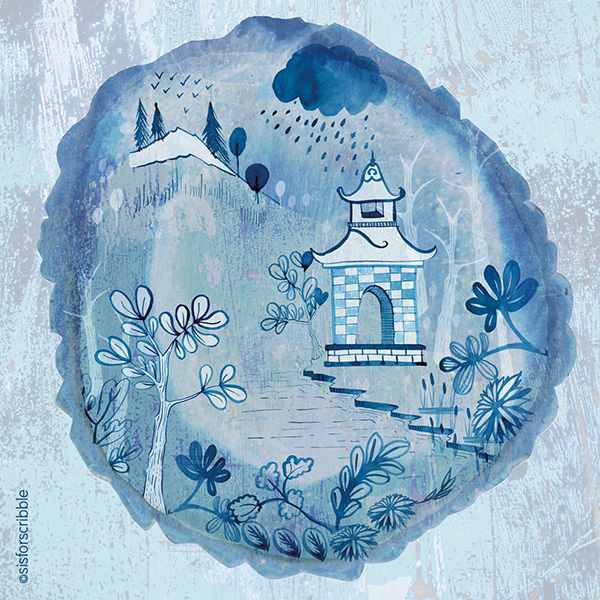
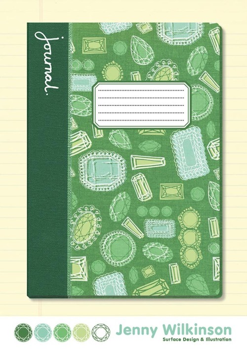
Here is the final journal design I created. Using the simple brooch designs to create a repeating pattern as a cover design. With the addition of a hand written journal font to the left.

jennywilkinson_gemjournal

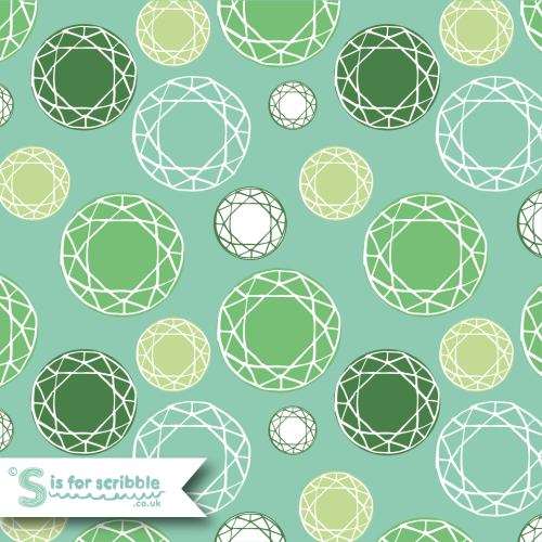
After creating the journal piece above, I was really inspired by the simplicity of the small colour swatches and the same facet design. So decided to play around with this to create a simple faceted polka dot design.

Gem pattern_sisforscribble

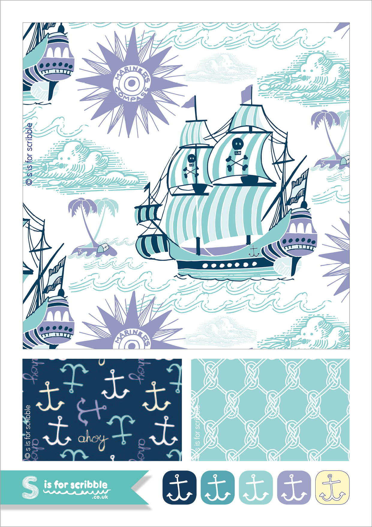
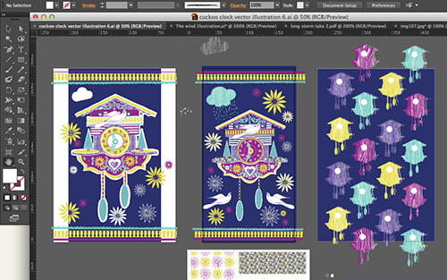
I have also been having a little play with an S is for scribble logo (see above) hopefully more of this to come in another post soon.

F is for Flower

F is for Flowers


…or F is for Folk Floral

folk floral pattern web

March & April were busy months for me taking part in Lilla Rogers MATS part B.

Although I wasn’t able to post much whilst the course was going on I will attempt to post some of my favourite pieces here over the coming weeks.

This folky floral print had been created in Week 5 for the Party Paper brief. The aim had been to create a design for paper plates and napkins, however it was clear that this was another design that would work better as a bolt fabric pattern. So here it is with a folksy geometric co-ordinate.

J is for Jelly

J is for Jelly post

Keeping with the A to Z theme of this scribble blog, this week J is for Jelly! (or Jell-o for the Americans out there!) I’ve had a fun month drawing lots of Jelly for the Lilla Rogers MATS bootcamp online course. The brief was to create a Jelly themed bolt fabric design. I doodled a lot with pen and ink; I’ve been using my traditional dip pen as well as a new bamboo dip pen. I then scanned the black ink drawings & doodles into the computer and created these prints and patterns below using photoshop & illustrator. I do love creating patterns!

Jelly Bolt fabric March post

Here is the final bolt fabric design I submitted for the March MATS bootcamp gallery. It shows the final pattern I went for and a simple co-ordinate print.
Below are some more patterns I played around with using a similar colour palette.

J is for Jelly co-ordinate fabric post 2

J is for Jelly co-ordinate fabric post 3

C is for Cuckoo Clock

C is for cuckoo clock C is for Cuckoo Clock. This was the first month of Lilla Rogers Mats Bootcamp online course. The brief was to create a mobile phone cover featuring a cuckoo clock design. We started off with a  mini assignment drawing all sorts of cuckoo clocks and decorative doodles.
Cuckoo Clock doodlesThis was then scanned into the computer and translated into digital illustrations.

cuckoo clock screenshot(above: some of my digital scribbling in progress)

I’ve been enjoying making lots of prints and patterns to match the main cuckoo clock illustration.

 c is for cuckoo clock

& here is my final cuckoo clock illustration (above) and the final layout I submitted to the February MATS bootcamp gallery (below)

Jenny_Wilkinson_February

After completing the mobile phone cover I couldn’t resist having a play with the patterns and repeats that were naturally appearing out of the cuckoo clock illustration; the borders and scallop designs and the Eidelweiss icons (Lilla loves a good icon!).Below are two bolt fabric designs and co-ordinating repeats using the cuckoo clock as the main starting point

Cuckoo clock bolt fabric 2

Cuckoo clock bolt fabric