K is for Key

K is for key book mock up_webK is for Key 

I’ve been having a lot of fun creating K is for Key. I have experimented a lot with the drawings and patterns whilst also silently singing to myself “I got the keeeeey,I got the secreeeett!”  (click here if you haven’t heard said song and wondering what on earth I am waffling on about!)

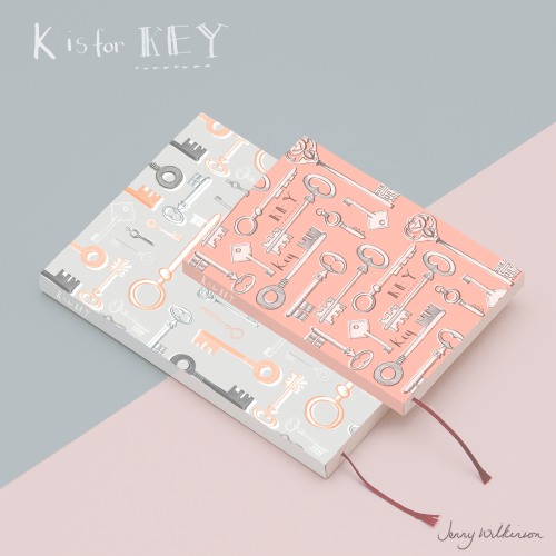
I decided to create a mock up with the key patterns, using them on a book mock up which could be a journal or a notebook. I haven’t shared a lot of my mock ups before, but it has been really exciting playing around with these patterns and I am really pleased with the outcome.
K is for keys ink drawings
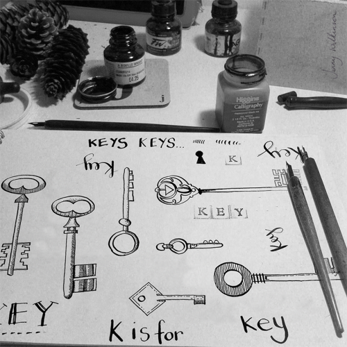
Key drawings in black ink and dip pen.

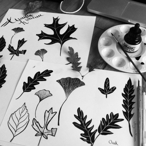
This has become my favourite way to create the initial drawings, using black ink and dip pen, then scanning this in at a high resolution and working with it either in Photoshop or Illustrator.

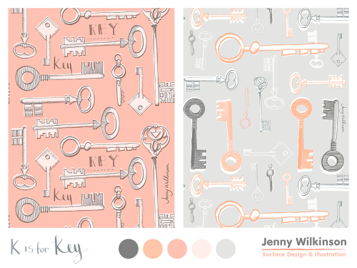
K is for Key Pattern

I’ve also been trying to break out of my usual turquoise and green colour palette. After some research into different colour palettes I really liked this peachy/salmon pink and grey combination.

To finish off my K is for Key designs here is a simple framed print, with some little wooden houses. Which made me think this could also make a pretty ‘New Home’ print or card.

L is for Leaf

It all started with a wander through Kew Gardens on a beautiful Autumn afternoon. I couldn’t resist collecting lots of beautiful fallen autumn leaves.
leaf-doodle

This led to a few inky doodles, using black ink and white gel pen. I then scanned my leaf doodles into the computer to create my full colour leaves (see below). Although I had a play with blue and green (my ‘go to’ colour palette), I thought I would stick to the autumnal colours.

l is for leaf

leaf-pattern-2-_web

and here is my autumnal leaf pattern.

D is for Digital Nomad

Digital Nomad Illustration

‘How To Succeed At Becoming A Digital Nomad’

That was the title of the article for the above editorial illustration. Created for the June MATS Bootcamp course.

Click here to read the article from Forbes.com

This is one of the first times I have attempted to draw people in my illustrations. But I really enjoyed the process and plan to experiment with some more editorial illustration briefs in the future.


C is for Crustaceans

Jenny_Wilkinson_May What a fun month May was at MATS Bootcamp. Crabs and lobsters and prawns oh my! The brief for the month was to create a surface design for some dinner plates with a ‘Marine Mashup’ theme. Basically a totally bonkers mix of pretty patterns and crustacean creatures. Actually, some of my favourite things to draw, so I was pretty happy “mashing-them-up” together.

C is for Crab
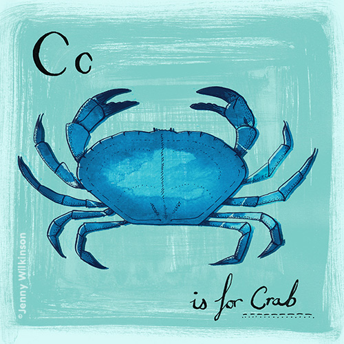
C is for Crab. Here is the more detailed, crab drawings created with a dip pen and ink.

Morocco was the source of the pattern inspiration for this ‘mash up’ . . . Moroccan ink doodles I had some fun playing with blue ink on watercolour paper. These inky sketches were scanned in to create the background pattern for the plate designs as well as this simple repeating pattern. Jenny Wilkinson_Moroccan pattern_web  If you would like to license any of these designs please e-mail jenny@jennywilkinson.com.

A is for Art

Art Gathering Poster

For MATS April Bootcamp Assignment we were given the job of creating a poster for the upcoming Global Art Gathering event in Brighton.

The mini had been to hand letter the words Global Art Gathering.

poster sketches_jw

Hand lettering sketches


After creating the lettering by hand using pencil, pen & ink.

I then scanned the drawings and took them into illustrator. Using the sketch as an idea for a composition, I created the poster design in illustrator using the colour palette that had been given to us.

vector artwork-01

Vector artwork without texture

Art Gathering Poster

photoshop artwork with texture added


I then added texture to the vector artwork in Photoshop using clipping masks and hand made brushes & textures. I really liked this technique and am looking forward to exploring this technique further.

P is for Pirate

This was a collection of kids illustrations and prints created last year. I struggled a little with the colour palette and deciding whether to work in Illustrator or photoshop. Having worked on it on and off for several months I am finally happy to reveal it here.

P is for Pirate_pattern_sisiforscribble

In the end I went with a simpler turquoise, purple and dark blue palette. I also pushed through with illustrator to create the patterns and artwork, prefering he flat colours for these compositions.

Below are some of the additional co-ordinating patterns in more detail:

Pattern Gallery

Anchors Ahoy

Pirate knots pattern_sisforscribble


Knotted (I’m still loving the rope & knotted nautical designs; here in a pale turquoise)

Pattern Gallery3


Palm Deco (revisiting a my palm tree pattern that works really well with this theme; recoloured in purple to match the colourway)


S is for Scribble

scribble-animation-web

Look, my first animation!

I’m secretly quite pleased with myself, I’ve been doodling and scribbling some new designs for an s is for scribble logo for the new print shop (hopefully opening at Easter). Whilst playing around with a new scribble-y logo I had the idea of creating this animated GIF. I’m looking forward to playing around with this animation technique on some more projects soon.

M is for Misty Mountain

M is for misty mountains_web

blue doodles

February Bootcamp mini was to draw from scenic plates. I chose to look at blue & white chinoiserie plates (which I have been really drawn to for sometime) so I was really excited to crack open the inks again and get drawing. For a bit of a change I decided to experiment with blue ink (rather than drawing with black ink & colouring it later in Photoshop)

The final design was to create a piece of art painted onto a piece of circular wood. Unfortunately I didn’t have enough time to find a piece of wood but used a photo I had instead and composited this with my original mini drawings.

I really liked the translucent quality and used this when layering up the final piece along with some paint textures. To create this quite mystical, magical moody mountain piece.

B is for Brooch

2015 kicked off with another round of creative bootcamp in the form of Lilla Rogers MATS bootcamp course. This first month we were tasked with creating a journal design inspired by Edwardian brooches.

The brooches I was most drawn to were simple designs with beautiful faceted gems in greens and purple.

Here are some of my initial doodles and drawings of the gems:  brooch sketches page web2

ink & wash drawings

pencil sketches

Here is the final journal design I created. Using the simple brooch designs to create a repeating pattern as a cover design. With the addition of a hand written journal font to the left.

jennywilkinson_gemjournal

After creating the journal piece above, I was really inspired by the simplicity of the small colour swatches and the same facet design. So decided to play around with this to create a simple faceted polka dot design.

Gem pattern_sisforscribble

I have also been having a little play with an S is for scribble logo (see above) hopefully more of this to come in another post soon.

T is for Terrarium

JENNY_WILKINSON_GTS14A1_LITTLE-TERRARIUM

My Little Terrarium – created for Lilla Rogers Global Talent Search competition. Fingers Crossed!